By: Nicolas Sosa
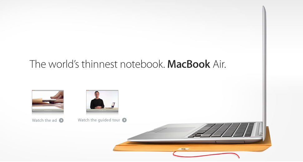
This Ad was made by Apple. It was created to advertise the Macbook Air. The Ad has the laptop and a yellow envelope to show and compare the thinness of the Apple Macbook Air.
Category Identification
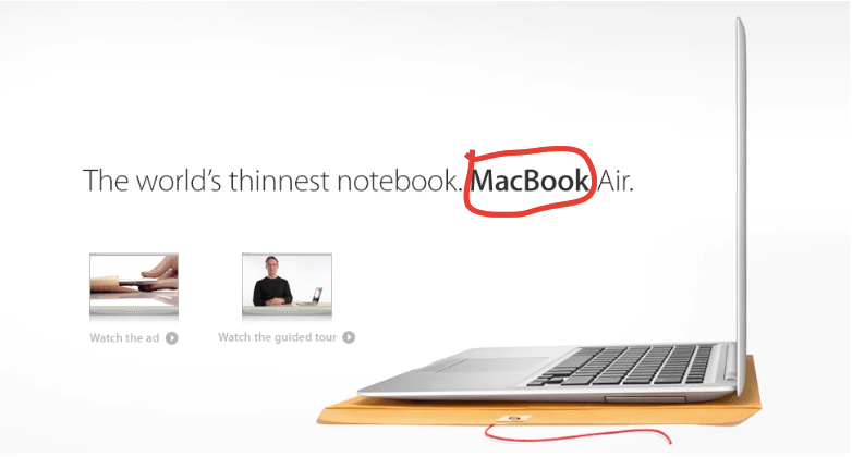
As you can see above, the word that is trying to be noticed first is “MacBook” and it is San Serif. I think that Apple did this to give their product and company brand a modern look. When using serif, it looks a little old school. This is modern technology. The words on the ad needs to match.
Typeface Contrast
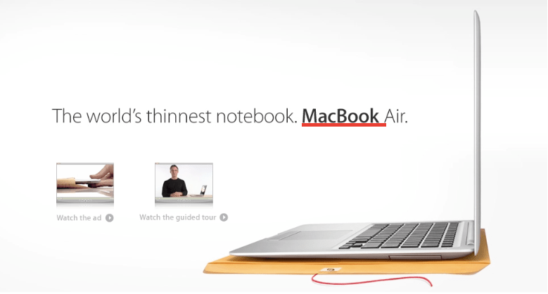
Typeface contrast is used well in the ad in order to direct your eyes to the word “MacBook”. The strokes of the word is thicker. It also looks super clean against the white background. When you look at the picture, that is the first thing that you are directed towards.
Photography

The leading lines in the photography are the keyboard body the MacBook and the envelope. They lead to you the links of the videos that are presented in the ad. Also the line of the words that are above the videos also point towards the actual laptop. The whole goal was to have the MacBook and the videos notices through the leading lines. The rule of thirds was applied very well. The MacBook is on the right side of the Ad.
Alternate Images for Layout
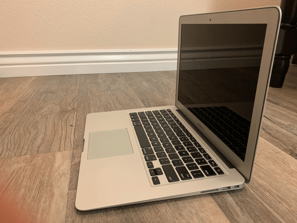
These are images that I took. The goal was to replicate the same concept as the ad. In all the pictures I put in leading lines to where the body of the text would go. I also added in the rule of thirds. I didn’t have the best spot for the pictures but I thought simple colors in the back are good. My favorite one is the second one. The birds eye view looks really good.


Conclusion
In conclusion, the ad created by Apple is incredibly simple but speaks volume in modernism. The Serif design adds to that and the rule of thirds applied looks really clean and gives enough space for the text and the video options. The leading lines are very simple to follow and clearly tell where apple wants you to look. The contrast of the words that Apple wants you too notice first is great. Its not too big but the stroke of “MacBook is just right to where that is the first word that you are directed to. Overall, the ad is greatly executed.
