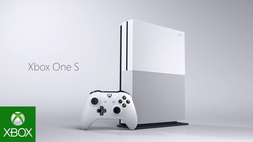
The reverse engineer project consist of analyzing four elements in visual media that are essential to talk to people visually. Proximity, alignment, repetition, and contrast. The next four pictures will illustrate the elements in this Xbox One S ad.
On the Campaign:
- Marketing Director of gaming division: Robert Matthews
- Chief Creative Officer: Casey Hudsen
- Art Director: Tim Dean
Analysis:
Proximity
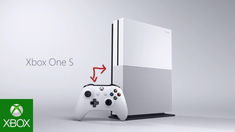
Proximity in visuals is group together the things that have relation to each other. In this ad, Microsoft decided to group together the console itself and the gaming controller. Without one, the other does not work.
Alignment
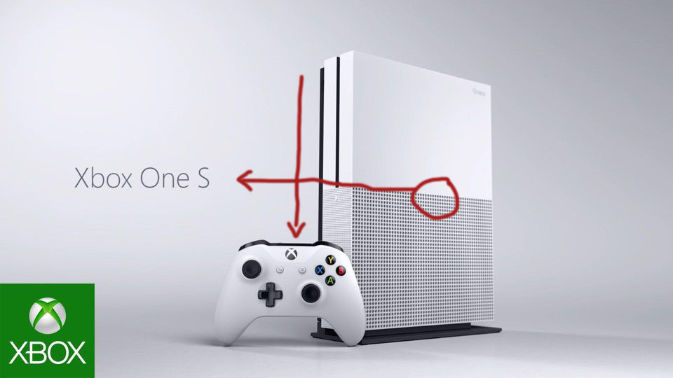
Microsoft did a great job adding leading lines into the ad. They want to direct you to the logo of Xbox. In the middle of the Xbox is where the line directs your eyes to the name of the product. The top left of the Xbox leads you right down to the Xbox logo on the controller. Its a very sharp look that is simple to see and comfortable for our eyes.
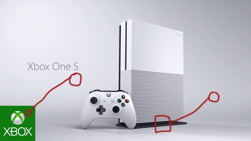
Repetition

You can spot the the word “Xbox” three times in the ad and the logo twice. Repetition in your ad is so crucial for the consumer to remember what they are seeing.. It settles better when people look at it. It doesn’t just have to be words, repetitiveness can be good through colors, lines, alignment etc. Repetitiveness is used to embed something into someone’s mind.
Color
Two colors mainly dominate this ad. They are black and white. The simpleness of this ad looks sharp to the eye. The only other colors are the Xbox logo on the bottom left and the buttons on the controller. Xbox takes control of this and rocks it! It has such a clean look.
Contrast

Shadows always show a good contrast between the product in the picture and the back ground. In this picture, if there wasn’t shadows behind this product, you would probably think that the xbox was floating. This contrast helps the viewer see where the xbox stands. The bottom left has a logo of Xbox which is green. I am not sure why Microsoft decided to go with that look, but I personally don’t think its very effective. It doesn’t really go along with anything else in the picture.
In Conclusion..
Microsoft created such a simple ad that really attracted me to the product. The leading lines were perfect. It left me looking at the name of the product and thinking about buying it. Which is exactly what they are aiming to do. They have one goal and that is to get you to buy this Xbox. I think that is why the ad is so simple due to the fact that they only have one goal geared to one product. The cleanliness of the color and contrast really had me impressed. Black and on white is such a simple contrast but Microsoft really rocked it this time with their Xbox One S ad campaign.
